issue
#2
july ‘18
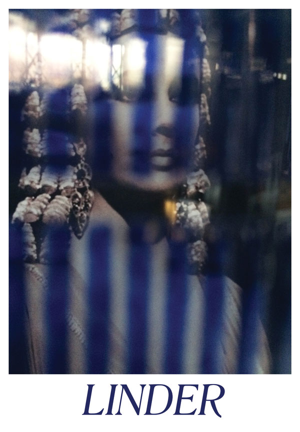
Linder Sterling.
Artist.
Paula Scher.
Graphic designer.
Bruce LaBruce.
Filmmaker.
SOLD OUT.
Companion work:
29in x 20in double-sided, full-color newsprint poster.
Linder.
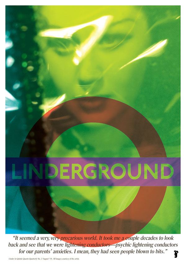
It’s no exaggeration that I’ve been trying to interview Linder Sterling, better known simply as Linder, for about ten years. I’ve been mesmerized by the originality in Linder’s work, which spreads over so many genres it feels like a mirror to the fancy-free mastery of Jean Cocteau, and spreads across so many notable places and people it always feels a bit, well name-drop-y, to even situate her. So I will in fact subject you to her bragging rights only because without it, one might not fully appreciate if nothing else, how wild it is that the entire London Underground transport system will feature her art across their handy, free-of-charge tube maps, among other installed contributions in her new commission later this year. Linder was an art school student working in collage during the very earliest days of the punk movement, notably creating the momentous cover for the Buzzcock’s “Orgasm Addict” single, featuring a nude female body with an iron for a head. The juxtaposition of pornography and household objects has threaded through many of Linder’s collage and photomontage works over decades and is so genius in its simple and urgent comment that it’s style is sometimes difficult to recognize in its ubiquity as being rooted in purely Linder. Her post-punk group Ludus from Manchester jumped ahead of its time in almost a single stride through art-punk and into some light blue whirlpool of feminism and free-jazz. She then committed one of the most notorious performance art acts in (punk) history (read on), dipped into bodybuilding and yoga, then started out the ‘90s by delivering a gorgeous collection of photographs of her friend Morrissey’s first U.S. solo tour. She then contributed these images to his iconic album art. From there she’s built a significant and recognized body of conceptual work, short films, performances (not least in the drag of Clint Eastwood), collages, and images, lassoing the label “artist” like few truly can.To get your arms around this expanse we discuss the role of anxiety from war on the advent of punk, the tidy myth of Factory Records, the daily hostage negotiation of public transportation, Londinium of Roman times, spaghetti westerns, contemporary sportswear, obtaining feminist texts in remote mining villages, the days when a TV had three channels, the archives of stately homes, medieval herbalist publications, the stuff of lasting friendships, and a reminder to never forget David Hockney came from the North.
Scher.
Ultimately what propels me toward interviewing an artist is when their influence seems too big to describe through a roll call of semi-meaningless laundry lists detailing projects the reader might recognize. When that just won’t do, because the cyclical band of the culture influencing the artist and the artist influencing the culture becomes a sort of infinity ring enveloping their story, I find the interview is that necessary honest gesture toward understanding the lay of their land. For instance, in order to map the importance of graphic designer and artist Paula Scher, the conversation must lay a boundary around New York City. The city, its people, its cultural institutions, and its conjoined twin commercial visual culture, provide the key to Scher’s work. Few names like Scher make both the professional and hobbyist graphic designer gasp more in excited admiration. Designers whose work could not be more alien to one another burst in unison: “She’s amazzzzzzing.” Usually followed up with some hop-skotch of ‘big’ ‘famous’ ‘important’—descriptors you immediately sense Scher could care less about and might even cringe at. For Scher is simply doing the work. The work that needs to be done, be it in service to the opera, the play, the credit card, or any number of things the public will wittingly or unwittingly touch, watch, want, use, or explore through the brilliant completion of Paula Scher's vision. Not least of the reasons to record Scher’s vision is that she remembers when you could beat another designer in a friendly-timed competition laying out a book without a computer: the opponent’s machine dragging deadweight while her Xacto-knife sliced in swift efficiency, decades before the former tool would become the admitted miracle-worker it has become for today’s designers. Back to our map: traveling along a road beginning somewhere around 1974 when Scher becomes a young art director at Atlantic Records, plotting jazz and rock and roll record covers, we travel toward the visionary boulevards of New York’s Public Theater, the Jazz Center at Lincoln Center, MOMA, the Metropolitan Opera, up through the borough of a Citibank identity system, a revamp of Microsoft’s Windows 8 logo, and the inspirational back alleyways of ‘60s protest signage, visual contributions of the counterculture, and Russian constructivism. The road eventually leads to the esteemed design firm Pentagram, where Scher has been a principal since the early ‘90s. Several exits lead to teaching positions at Cooper Union and the School of Visual Arts where she advises portfolios of young designers. Our map then becomes somewhat meta as we then cross the literal maps of Scher’s fine art practice combining typographic indicator and geography through painting large scale maps, as well as the pleasantly coincidental history of Scher’s father’s mapmaking profession and clever invention that successfully corrected the curvature of the Earth in aerial image capture. Notably the pavement of our abstract map is the material of typography: Scher’s iconic use of the word-as-form in branding has almost branded typography itself, in a beautifully cyclical expression going back to that aforementioned infinity ring. As with many artistic styles that simply make so much sense, it's hard to imagine an industry without Scher. And therefor her decades of successful identities and designs often take on a sort of frequency that in turn become so, influential shall we say, it becomes even more important to stop and take stock in an originator like Scher.LaBruce.
Bruce LaBruce has been using filmmaking to disrupt the status quo in mainstream, gay, and punk for decades. His pornographically-charged films have managed to continually piss off both censors on the right and left through his unrelenting commitment to what golden-era gay pornographer Fred Halstead once assessed as his autobiographical philosophy: “A pervert first and homosexual second.” Because of this, or in spite of this, LaBruce’s films have staked out distinct worlds burrowed deep in the labels of eroticism, Situationism, Marxism, radical queer cinema, camp, comedy, uncompromising in his refusal to pick and choose between correct and incorrect subjects. One might not expect to read the next sentence as reporting that a conversation with LaBruce is nothing short of robust, hilarious, and warm. The acclaimed director is something of a Canadian treasure in the world of independent filmmaking. The following topics move through under-historicized movements of queer punk subcultures in the '80s-‘90s in Toronto, the tactics and repercussions of a lifetime of art censorship by the authorities, the bitchiness of one's twenties, relationships between Eastern philosophies and Situationism in the Ego, the maintenance of mental health during the creative process, the class war, the fashion of skinheads and gay clones in retrospective, Lesbian separatists as friendship groups, horror films, fetish films, the advent of the mainstream gay relationship, and more. This may set the context for LaBruce’s most recent film being banned in several gay and lesbian film festivals in the West while being critically recognized in places as far as Bangladesh. LaBruce forces us to examine trends-as-progress and progress-as-trends, while this groundbreaking figure refuses to lay in the laurel hammock of how far the gay agenda may have come in its homogeny. A uniquely posed history, the world of LaBruce could rightly fill film class auditoriums for years to come, and this is perhaps a to-do list of ten thousand plausible term papers. Special thanks to Linder, Bruce, and Paula for the images, as well as to Pentagram in New York.